Briefs, shipped.
Every project starts with your goal and ends with deliverables you can use.
 Print
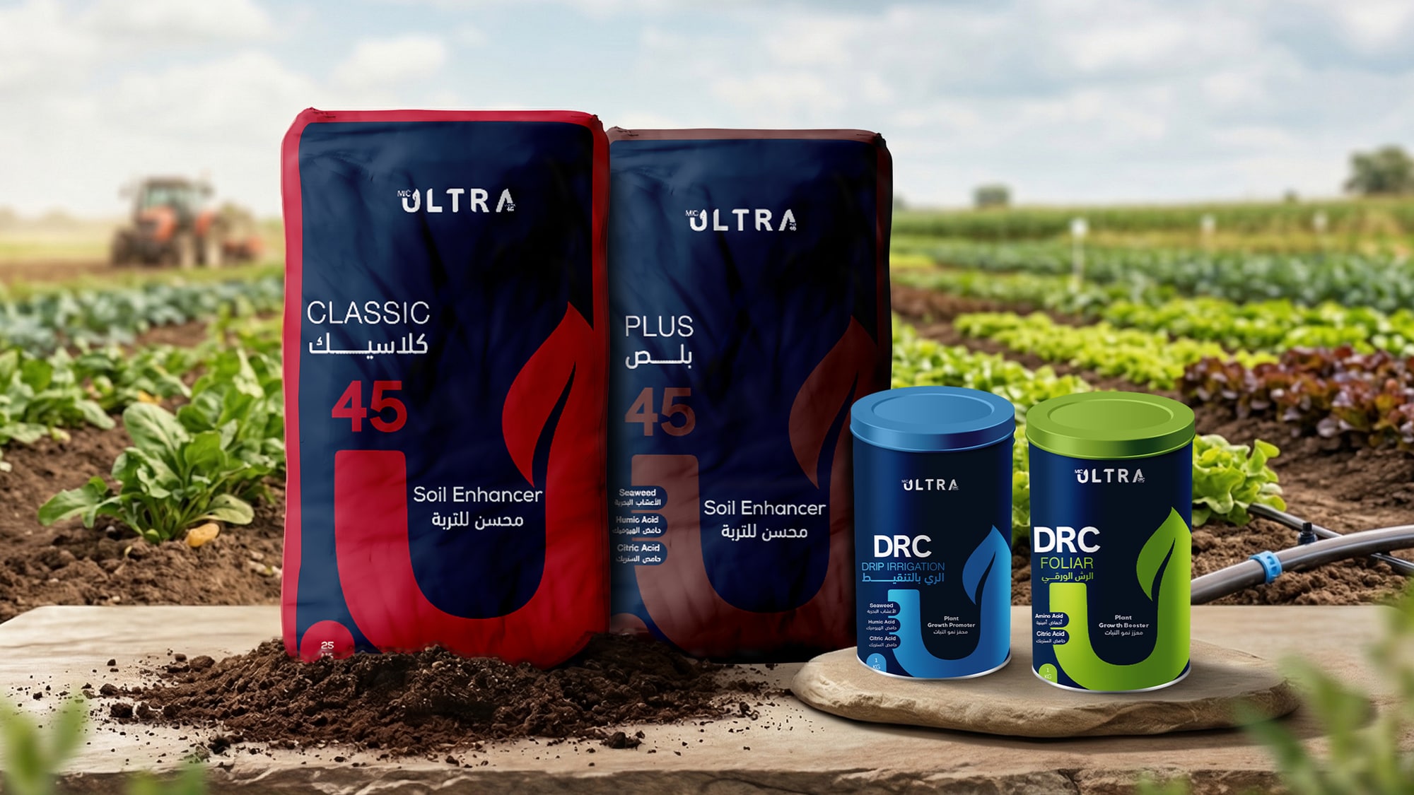
PrintUltra: fertilizer packaging
Four products share one bilingual grid, so the grade reads in seconds and the line looks like one trusted family on the shelf, pallet, or in the field.
 Digital
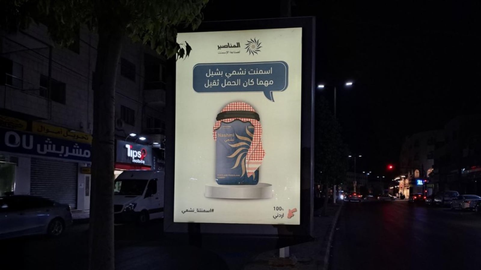
Nashmi: 360° campaign
The cement story escapes commodity grey through one hero lockup of bag and shemagh, running from street mupis and delivery vans to digital displays and short-form video, legible at highway distance and inside a mobile feed.
 Print
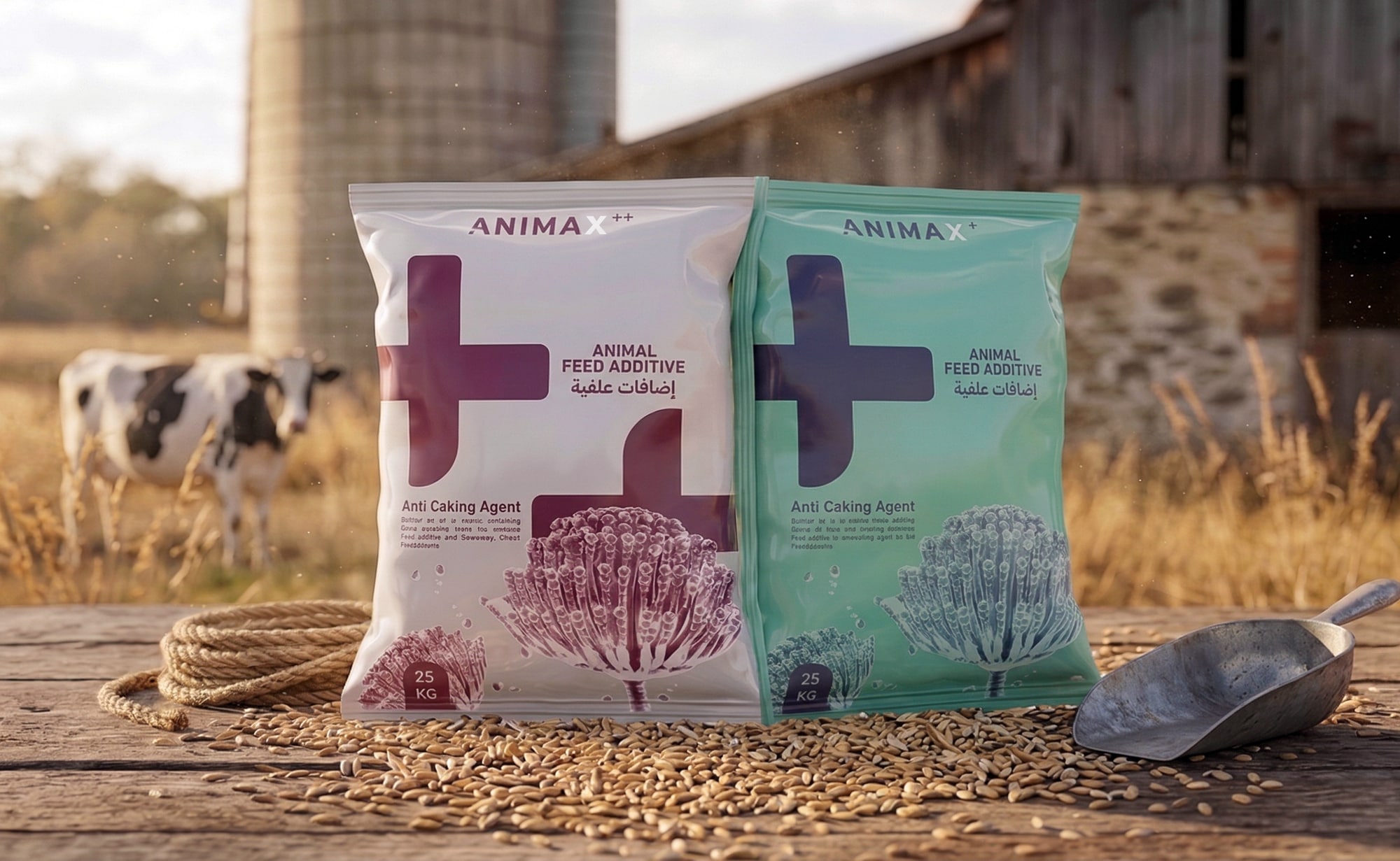
PrintAnimax: feed packaging
Two SKUs share one bilingual layout. A single plus or double plus calls out the grade at a glance, with Arabic and English balanced so the shelf stays calm.
 Branding
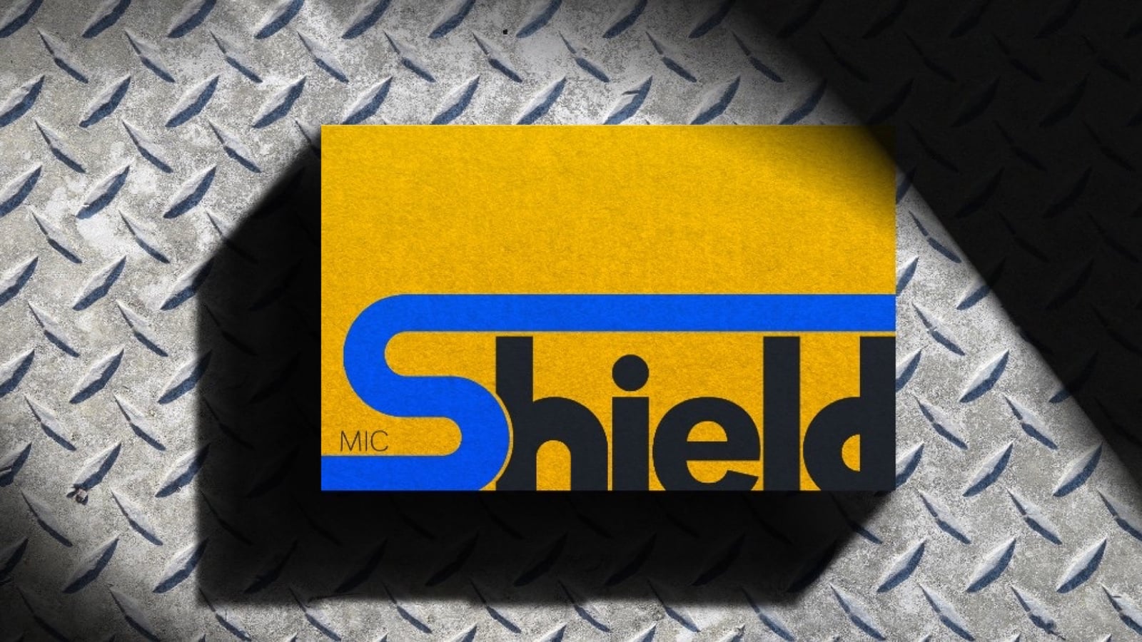
Shield: rebrand concept
A disciplined visual voice carries the building-materials brand across blade signs, delivery fleets, packaging, outdoor banners, and social channels.
 Branding
Surora: brand & web
A bilingual studio identity runs from a gradient Arabic-English lockup through feed carousels and motion into a long landing page, presented inside a fixed scroll preview so the story stays scannable.
 Print
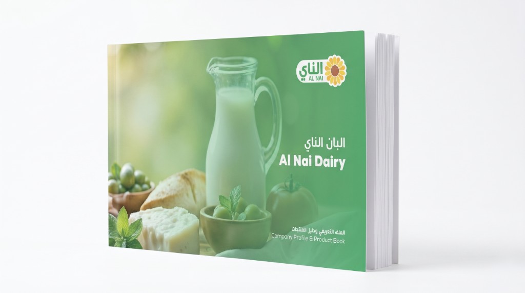
PrintAl Nai: company profile
A bilingual dairy company profile and product book run as magazine-style chapters, with art-directed food imagery tuned to a green-and-white palette for a premium read.
 Print
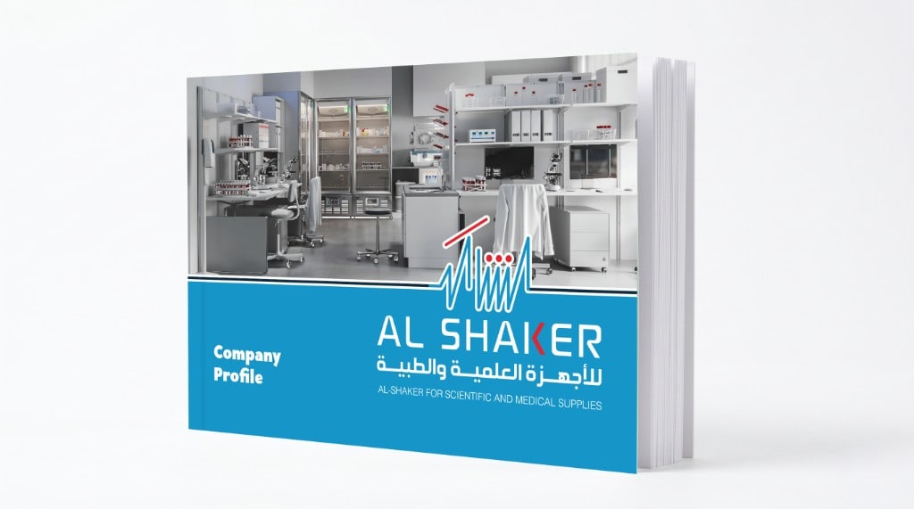
PrintAl Shaker: company profile
An English company profile for a scientific distribution firm carries one house voice across sectors, partners, and projects, so the full deck reads as a single confident brand instead of stitched supplier PDFs.
 Digital
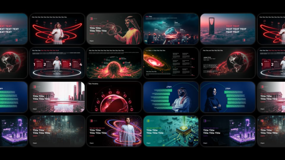
Decks & content design
Presentation and proposal decks built for real meeting rooms: clear visual hierarchy, restrained use of colour, and bilingual grid layouts that keep heavy content legible on a projector, in a PDF handout, or under a tight review.
 Digital
Social & motion
Feed-native formats gather in one place: still posts, reels, carousels, and short videos built for real platforms instead of hero mockups.