Shield: rebrand concept
A disciplined visual voice carries the building-materials brand across blade signs, delivery fleets, packaging, outdoor banners, and social channels.
The Challenge
Construction branding tends to repeat metal textures and generic claims. The brief asked for an engineered, durable tone, clear at the counter and bold on the highway.
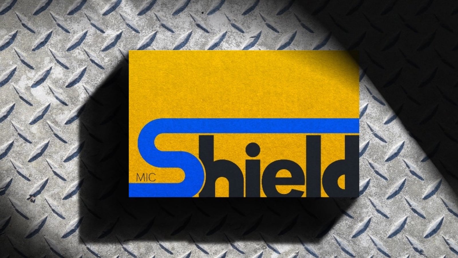
The Approach
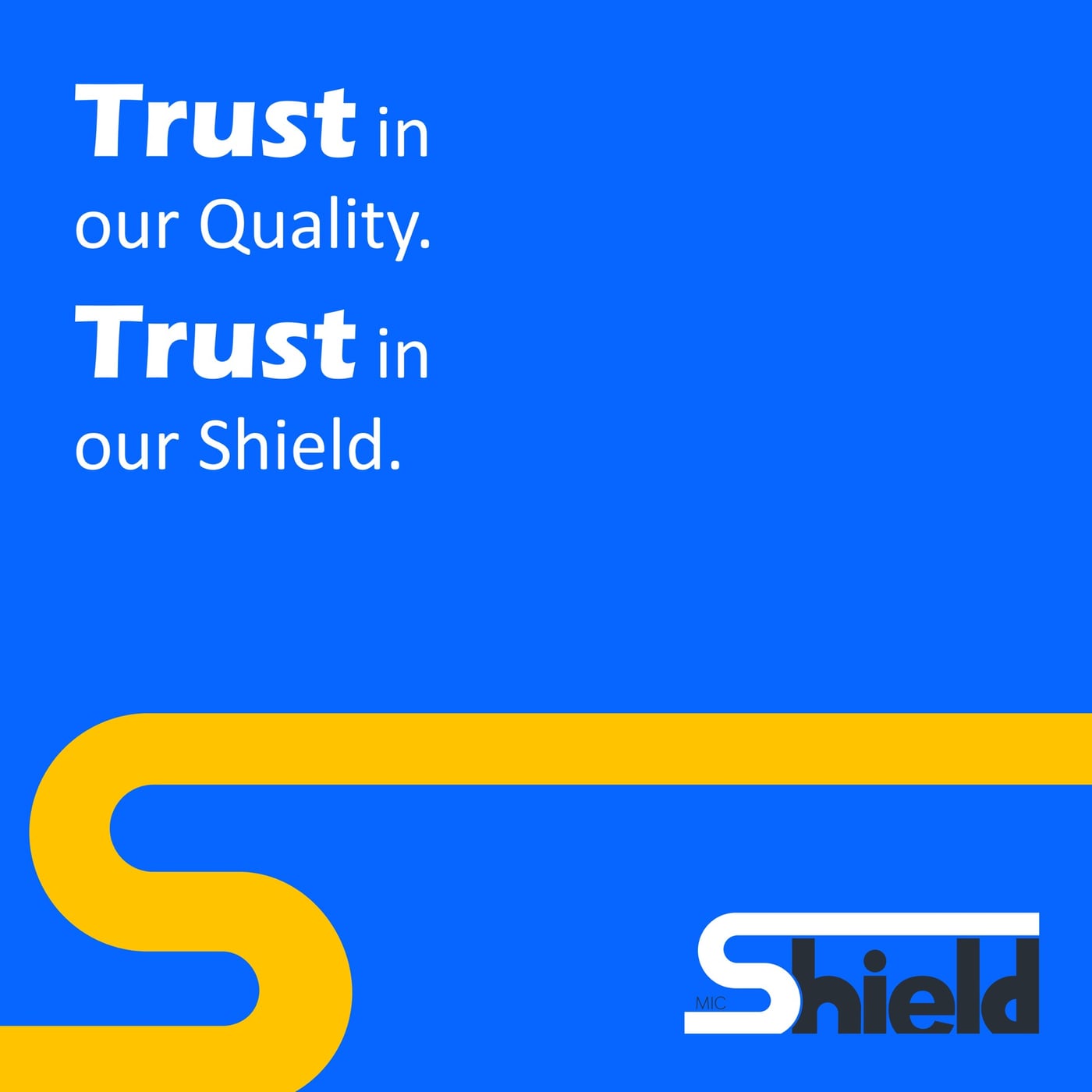
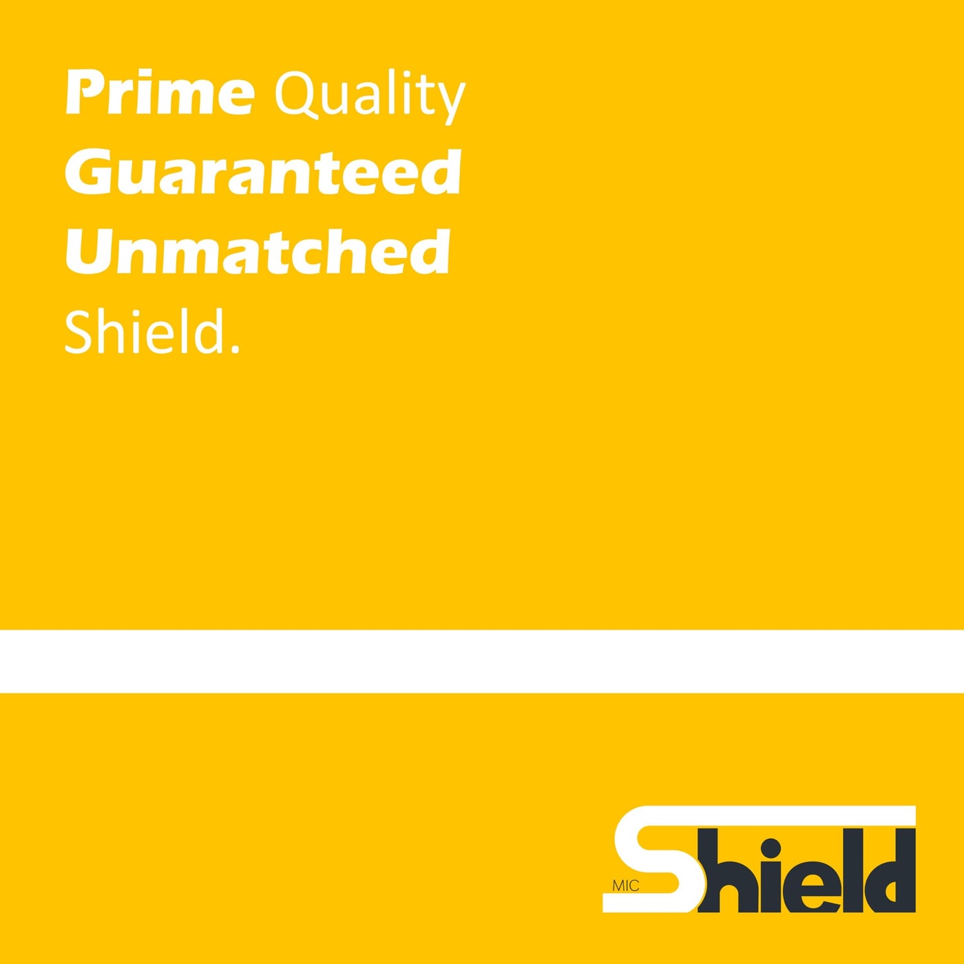
Industrial signage logic sets the tone: a gold field, a blue S used like a structural beam, and heavy Eras type. Layout studies at counter scale and at roadside viewing distance locked contrast and legibility before the system was finalized.
The Outcome
One consistent idea runs across secondary marks, fleet branding, packaging, social posts, and outdoor banners.
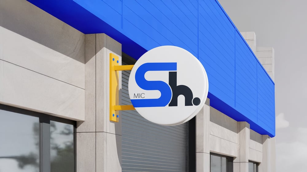
The Secondary Mark
The secondary mark sits at eye level, sized for a blade sign and legible from across the street.
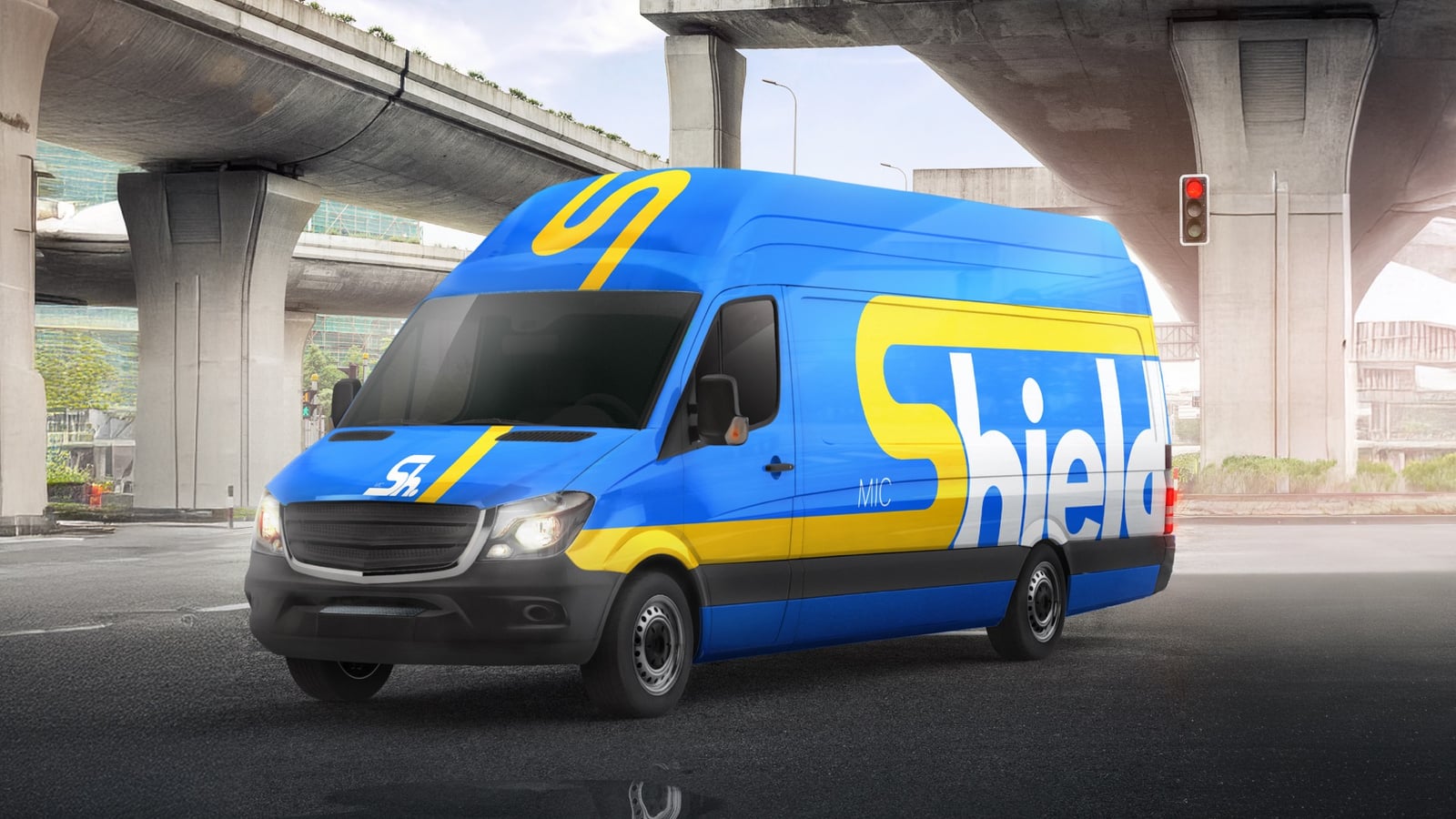
Fleet Branding
Vehicle graphics use high contrast and a bold mark that stays legible even at highway speed.
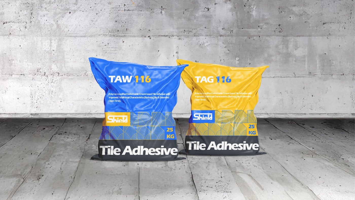
Industrial Packaging
Product bags carry a clean, minimal layout built for dust, forklifts, and direct sun on an active construction site.
Social channels
Social posts apply the same color and type system, with layouts built for silent scroll and bold English headlines.
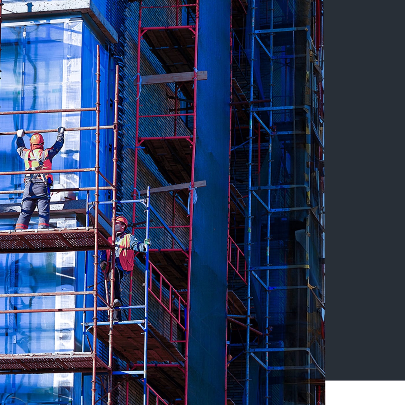
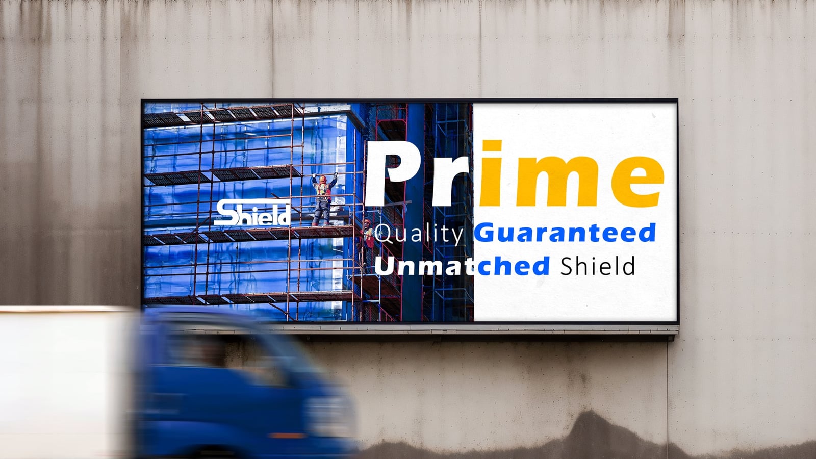
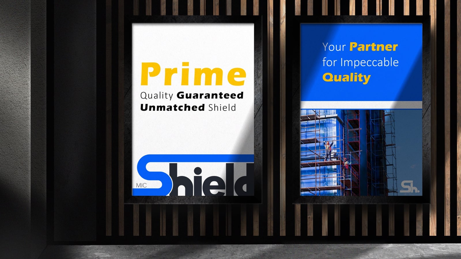
Large Format
Vertical banners hold clean type over real photography, so the brand stays calm against a busy backdrop.
The Foundation
The brand guide locks logo use, color, type, and spacing, so the system holds together across every format the brand has to reach.

Want a brand system that travels?
When a brand system has to move from packaging to fleet to feed without losing its spine, the same process applies here from concept to launch.