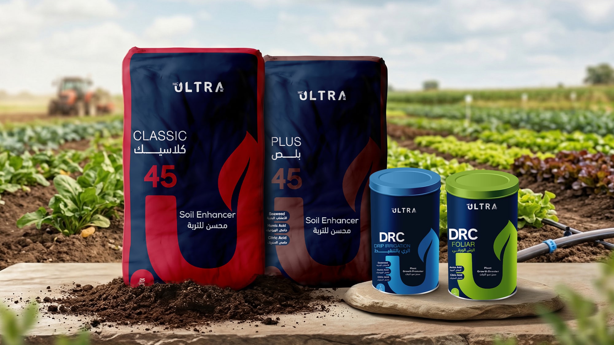
Ultra: fertilizer packaging
Four products share one bilingual grid, so the grade reads in seconds and the line looks like one trusted family on the shelf, pallet, or in the field.
The Challenge
Agri packaging tends to blur together on the shelf. The line had to feel premium across sizes from a 1 kg can to a 25 kg bag, with Arabic and English carrying equal weight on every face.
The Approach
One grid holds the mark, the product name, a strong U, and a dedicated color per formula. The same rhythm repeats on every size, so the range reads as one brand instead of four separate bags.
The Outcome
Four variants shipped as print-ready art on two substrates, with bilingual dielines built for real agricultural retail.
The System
The layout carries Arabic and English on one grid, with a single benefit line and a dedicated color per formula, so each product reads in a glance on the shelf.
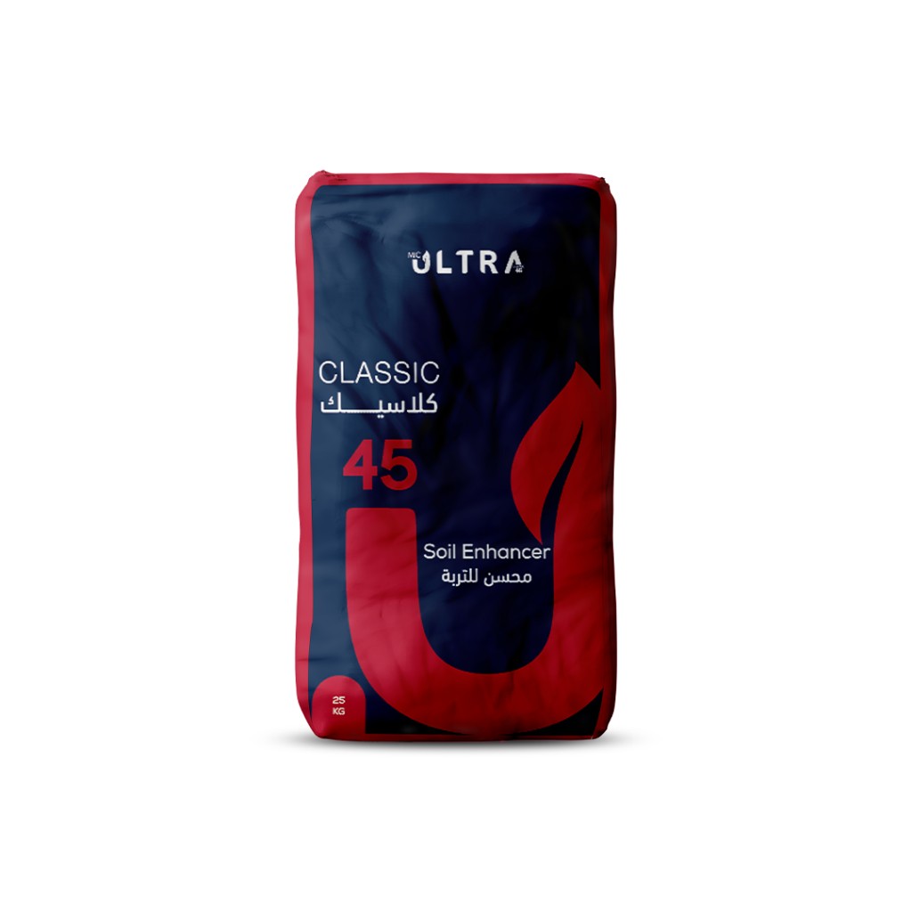
Ultra Classic 45
Soil enhancer
25 kg bag
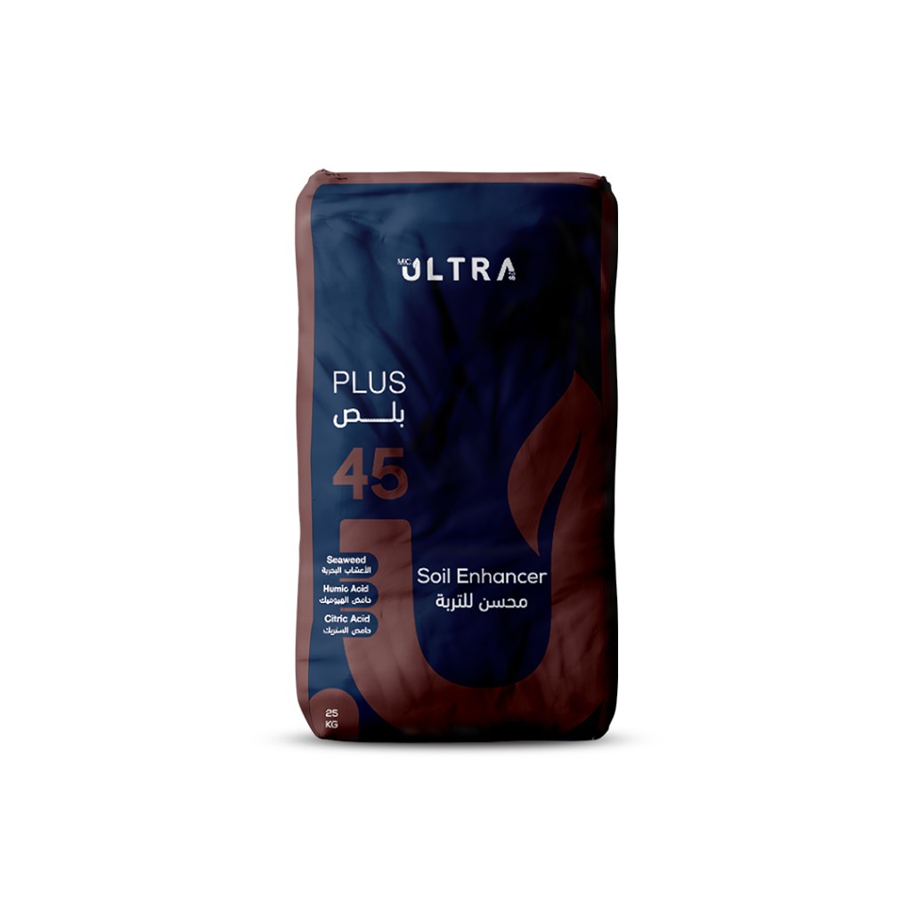
Ultra Plus 45
Soil enhancer
25 kg bag
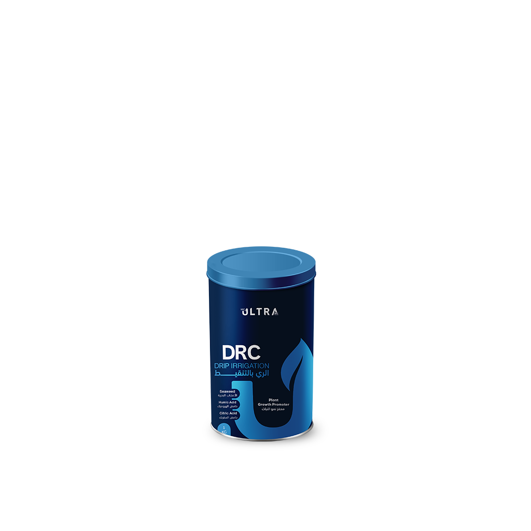
DRC - Drip irrigation
Plant growth promoter
1 kg can
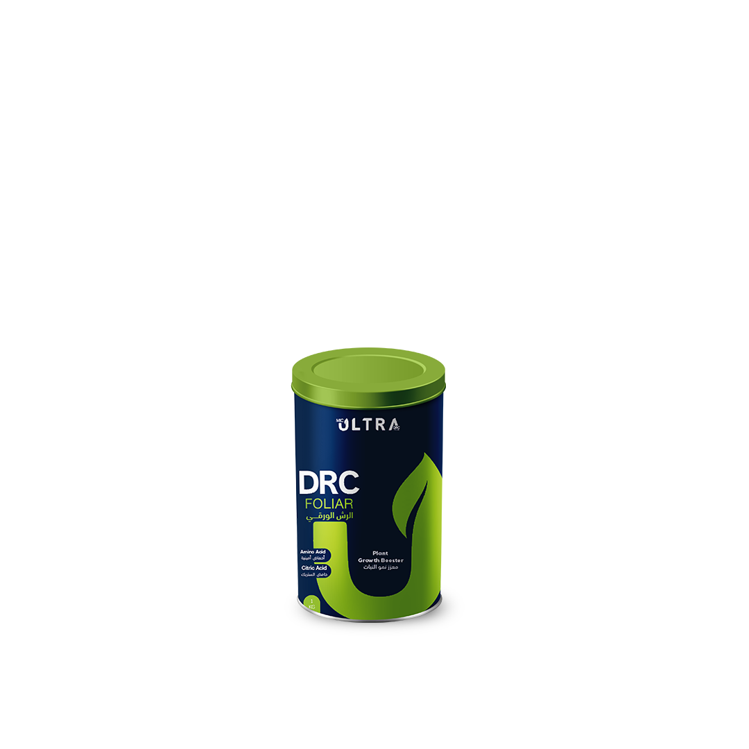
DRC - Foliar
Plant growth booster
1 kg can
Posts & short motion
The same visual system extends into social: vertical reels, square clips, and static posts keep the hierarchy and color rules intact across every platform.
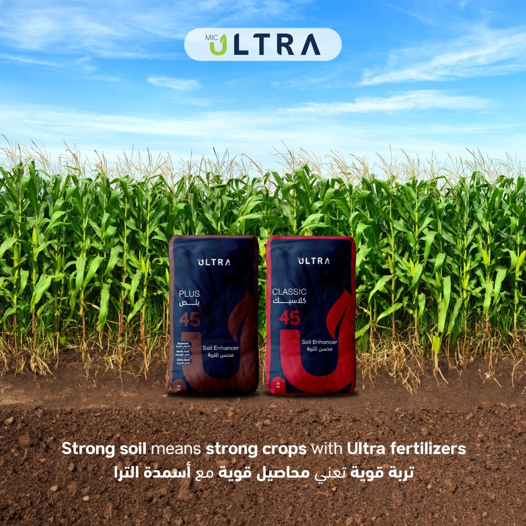
In-field photography of Ultra Plus and Classic, with a bilingual headline locked at the top of the frame.
A fifteen-second motion cut condenses the shelf story for short-form platforms.
A square motion cut keeps the message legible inside the Instagram grid and other square placements.
Need a scalable system like this?
When a design system has to travel from print to the shelf to social without losing its spine, the route from brief to final files is built to scale here.