Decks & content design
Presentation and proposal decks built for real meeting rooms: clear visual hierarchy, restrained use of colour, and bilingual grid layouts that keep heavy content legible on a projector, in a PDF handout, or under a tight review.
The Challenge
Much of the work is long, data-dense, and many-stakeholder: the slides have to follow brand and readability rules, stay ordered when the narrative shifts, and not fall apart when numbers or text change late.
The Approach
The design is built in layers: a repeatable cover and section system, a type scale for Arabic and English, breathing room for tables and charts, and a clear line from the opening title to the final ask—so each spread reads as one family, not a patch of random templates.
The Outcome
A slide system that survives export and reuse: the same file set works in the room, in email, and in the next round of edits, without the layout fighting the content.
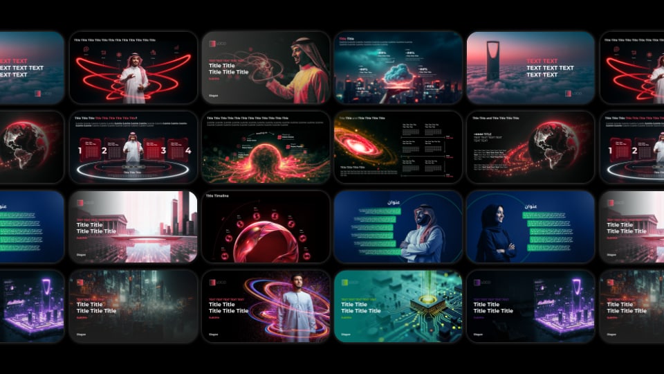
Slide work: covers, data, and pace
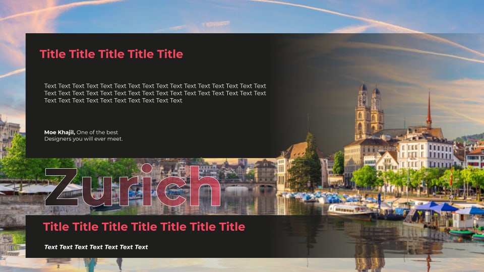
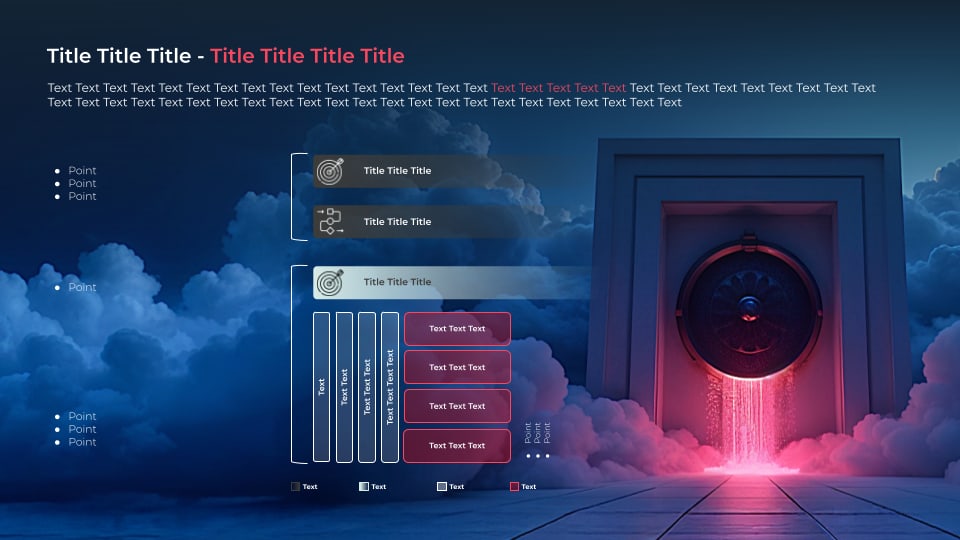
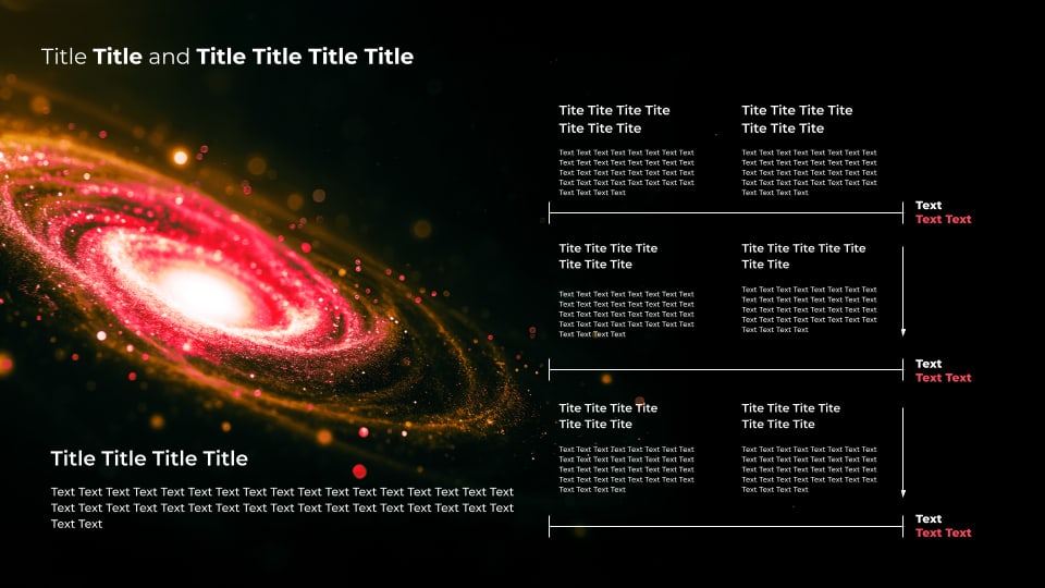
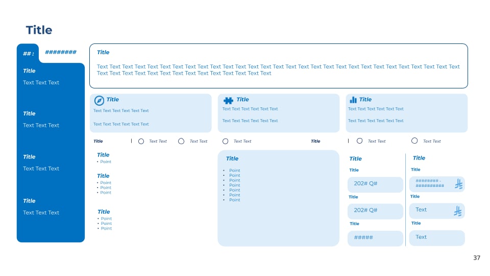
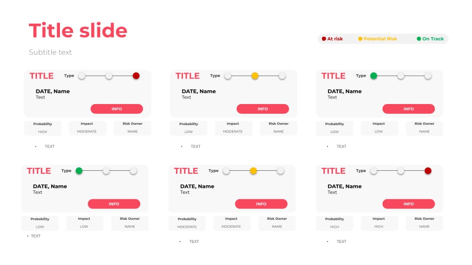
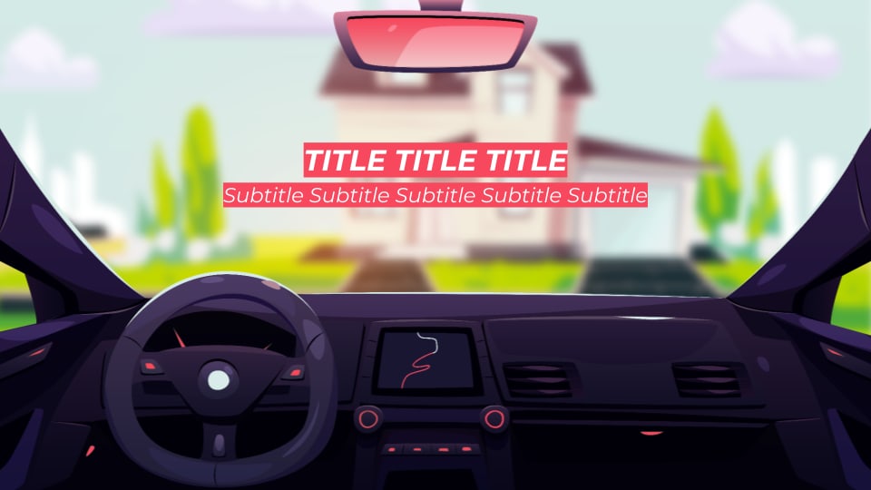
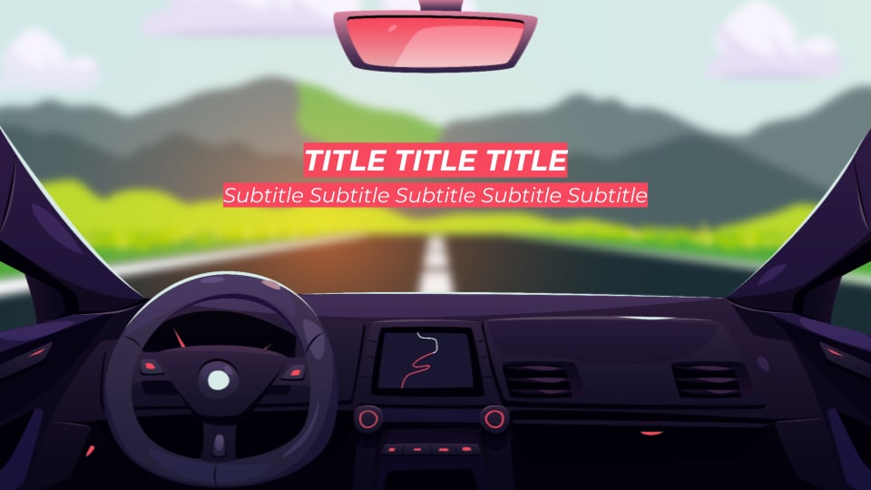
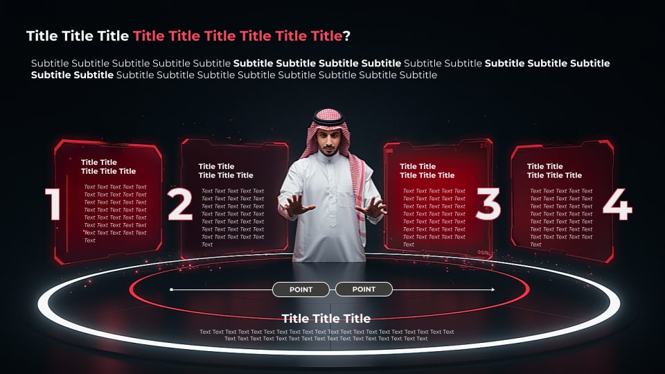
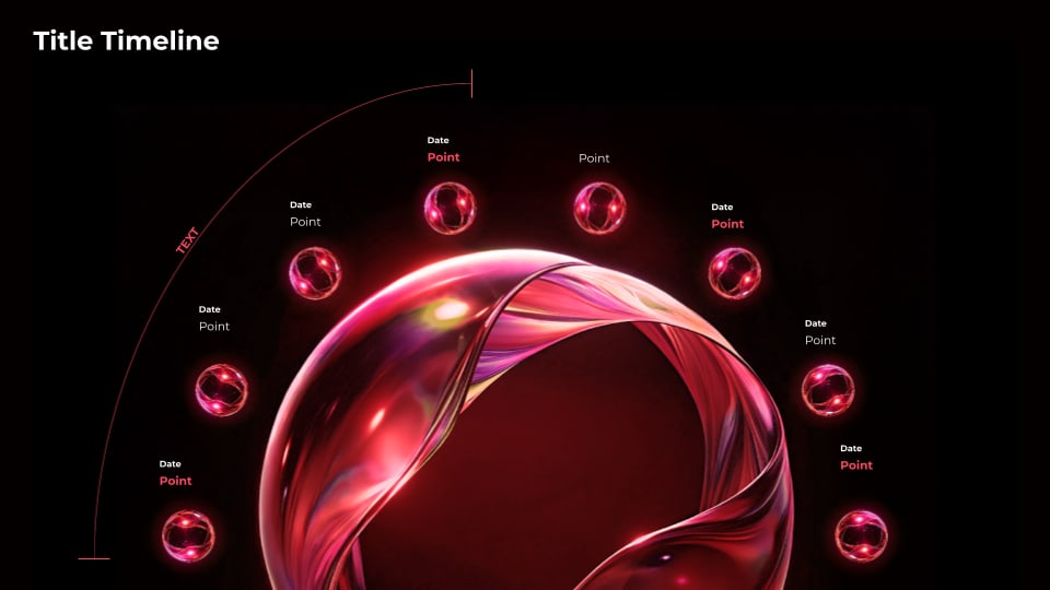
A cross-section of live deck work: title systems, section frames, data-heavy spreads, and bilingual page pairs. The band below scrolls to show a wide range of grid and typography treatments, not a single one-off template look.


Need a deck that earns the room?
If the next file has to win attention without shouting, the work starts the same way: content structure, then a tight visual system, then the finishing layer that supports the message.